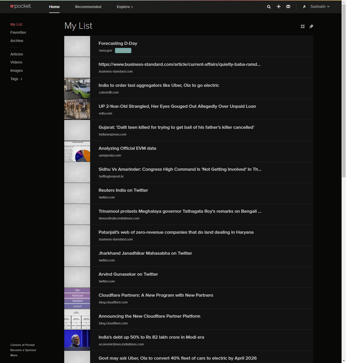
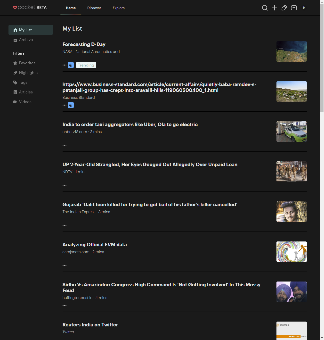
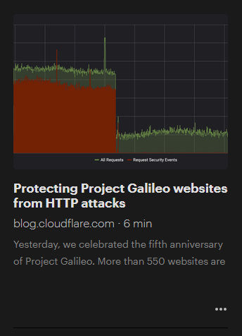
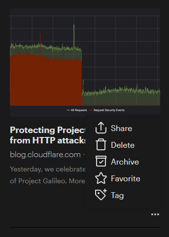
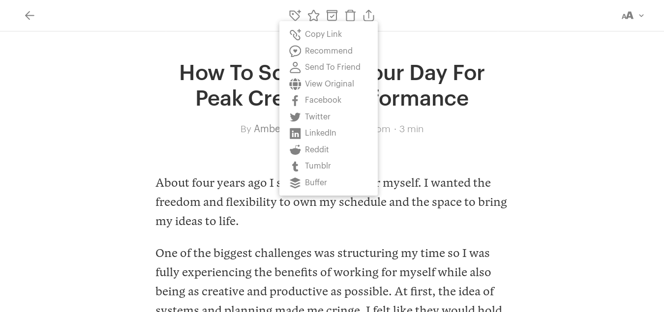
even if i switch to tile view... i absolutely hate the menu that is required to do anything with the article. especially archive. when they have so much space available. this is basically magnified in the list view where there is no excerpt. so much space. yet one has to access the menu to access the article options.
On desktop one usually copies the link for sharing unless there are direct buttons available. Pocket developers certainly don't think so. A simple Twitter search would show that people share direct links frequently that won't work for anyone but them alone
This website uses affiliate links. This means that if you click on a link and make a purchase, we may receive a commission. This does not affect the price you pay for the product.
This site uses cookies to help personalise content, tailor your experience and to keep you logged in if you register.
By continuing to use this site, you are consenting to our use of cookies.