
-
Amazon Deals - ToS - Like us?
You are using an out of date browser. It may not display this or other websites correctly.
You should upgrade or use an alternative browser.
You should upgrade or use an alternative browser.
My two cents for the Vodafone Idea company, post yours.
- Thread starter itachi
- Start date
- Replies 49
- Views 7,714


Trex
This is the way
I'm also planning to port my jio into vi whenever my current plan is going to expire.
At my current place I have little signal from both Jio and airtel and hardly get above 4-5 mbps speed. But one day test my friend's vi and it straight went above 60mbps.
Currently I am using 4G booster to make calls indoor and even 4g booster can't make internet better. Also, the vowifi is not stable on jio/airtel (automatically disconnect) and because of that I missed several calls. I am fed-up with these two. This is the reason for porting to vi, I mean how worse can vi be then my current situation with jio/airtel.
At my current place I have little signal from both Jio and airtel and hardly get above 4-5 mbps speed. But one day test my friend's vi and it straight went above 60mbps.
Currently I am using 4G booster to make calls indoor and even 4g booster can't make internet better. Also, the vowifi is not stable on jio/airtel (automatically disconnect) and because of that I missed several calls. I am fed-up with these two. This is the reason for porting to vi, I mean how worse can vi be then my current situation with jio/airtel.

Lolita_Magnum
ᓚᘏᗢ
If you work in older IT Parks in Mumbai, you will quickly realize that inside compounds and towers, the only network that actually is working is Vodafone.
Initially we barked on other telcos because even after multiple calls especially to VPs nothing was really being done.
Later we got information from our neighboring park aka Nesco that when these places were built in ancient times, Vodafone had deals with Park Owners to not allow other telcos to set up infra inside and that is still ongoing for many years now.
I guess that is where the old saying came, 'Vodafone ameero ka network'. Not so true anymore lol.
But I absolutely hate Airtel for what it is worth, their malpractices and empty promises and while Jio is good it falls short in very mysterious ways congestions being one of the popular ones and no specialized plans for customers.
Initially we barked on other telcos because even after multiple calls especially to VPs nothing was really being done.
Later we got information from our neighboring park aka Nesco that when these places were built in ancient times, Vodafone had deals with Park Owners to not allow other telcos to set up infra inside and that is still ongoing for many years now.
I guess that is where the old saying came, 'Vodafone ameero ka network'. Not so true anymore lol.
But I absolutely hate Airtel for what it is worth, their malpractices and empty promises and while Jio is good it falls short in very mysterious ways congestions being one of the popular ones and no specialized plans for customers.

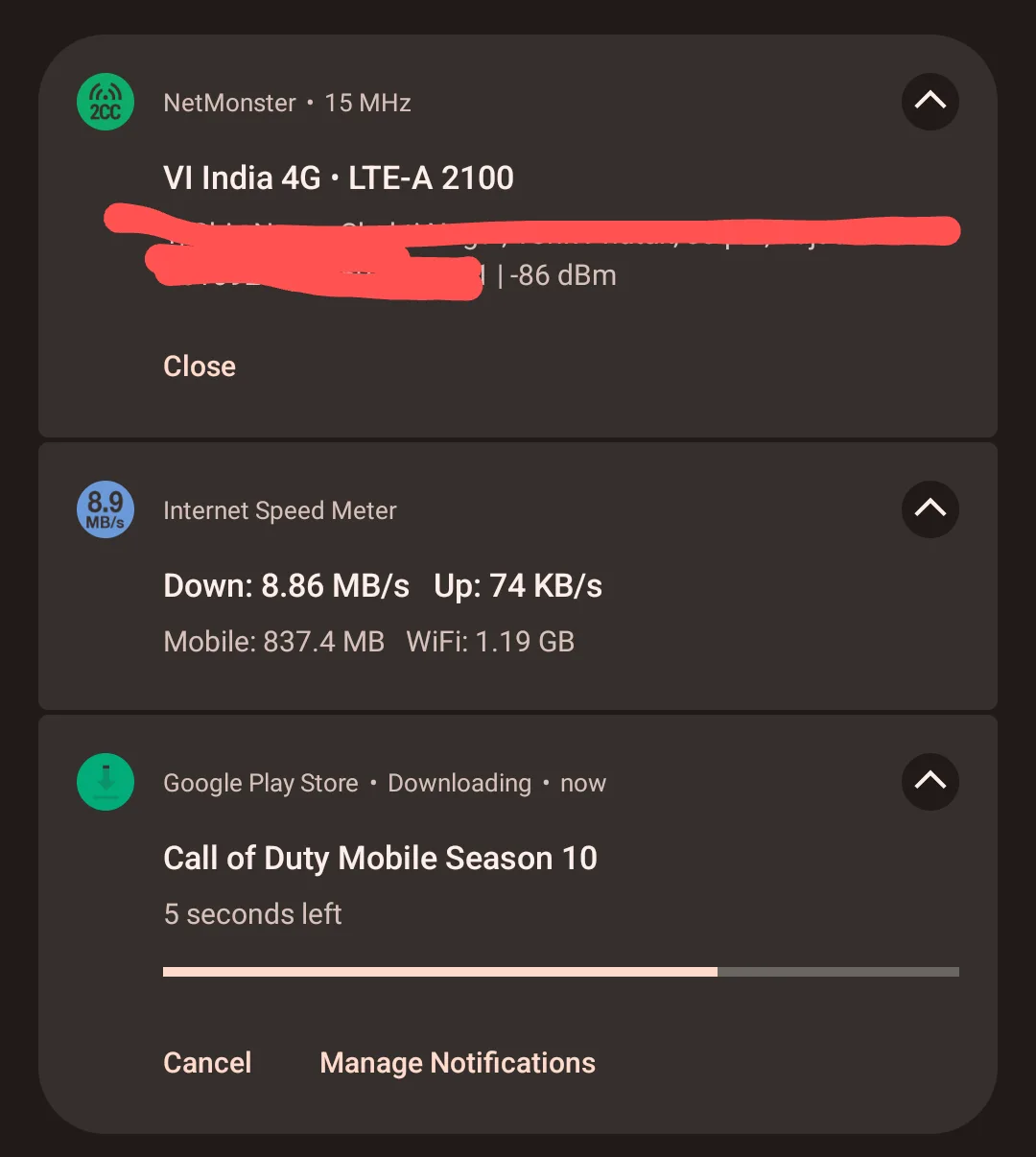
Frankly I don't see why I shouldn't use Vi when I get these speeds at my home (this test was done at deep indoors in basement). Speeds are constant throughout my house. Pair it with 12-6 AM unlimited data (although I don't need it as I use wifi) is no brainer for anyone.
Jio's results can already be seen above.
Last edited by a moderator:
@itachi I salute you brother 
Yesterday you said in this post
Seems like Vi guys are here in this forum
Today I was randomly checking their International roaming packs as I am going out of India in a few months.
I noticed their website's roaming page had different fonts.
I thought it was always like that so I continued browsing anyways...
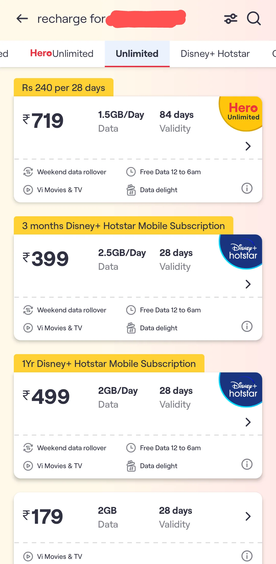
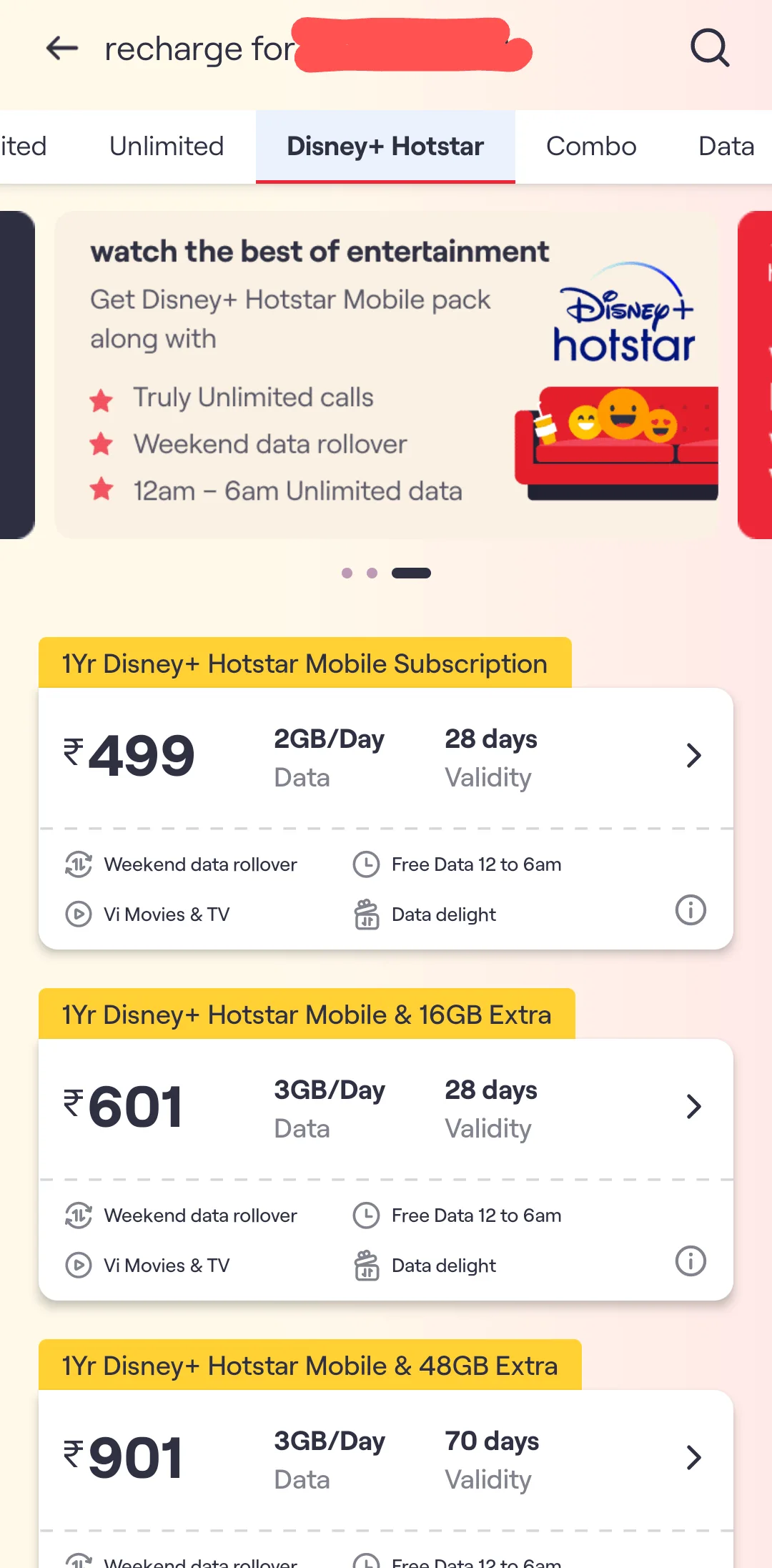
Then to check it particularly for my number I opened the Vi app and guys... just look what I saw...
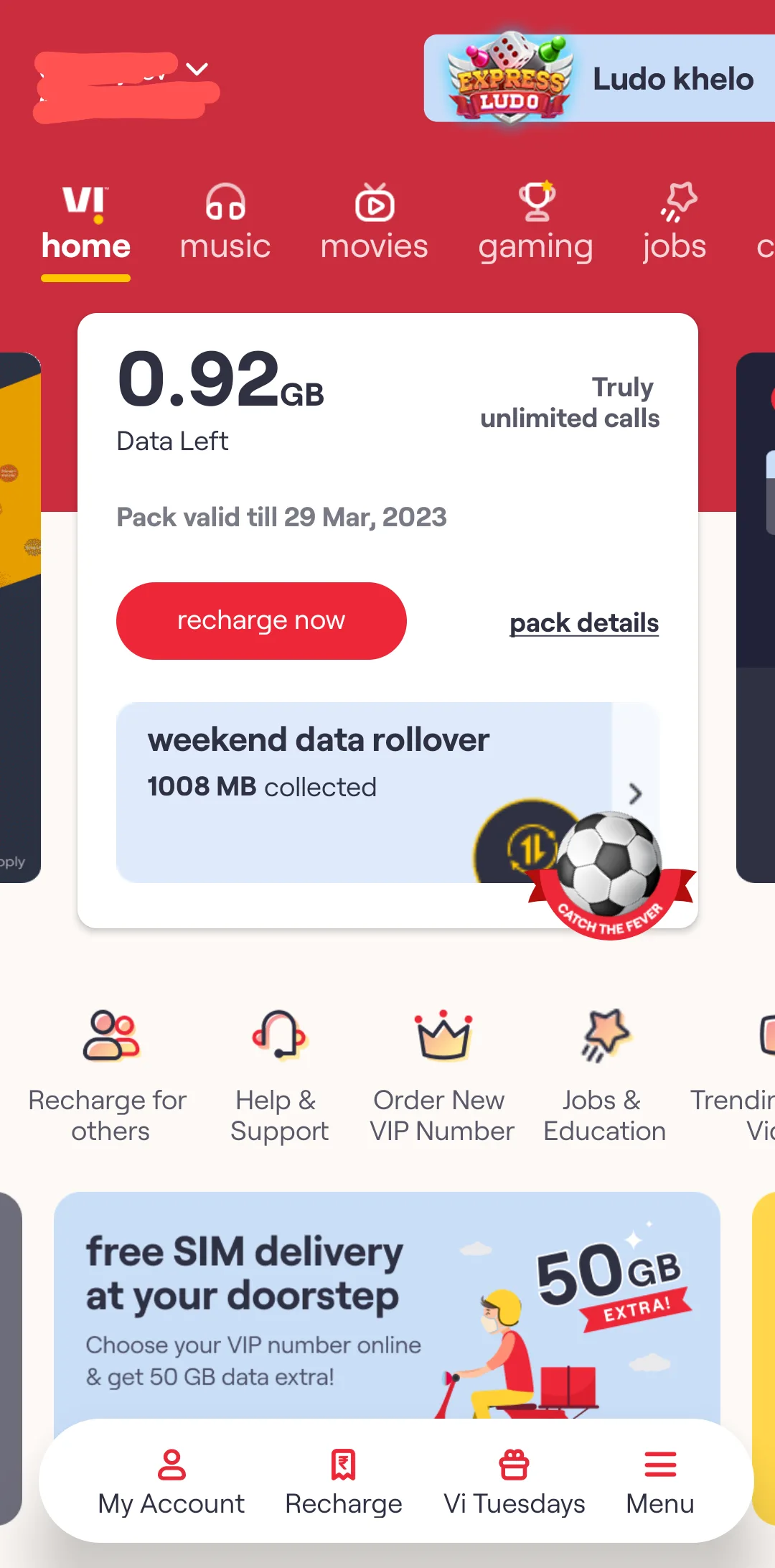
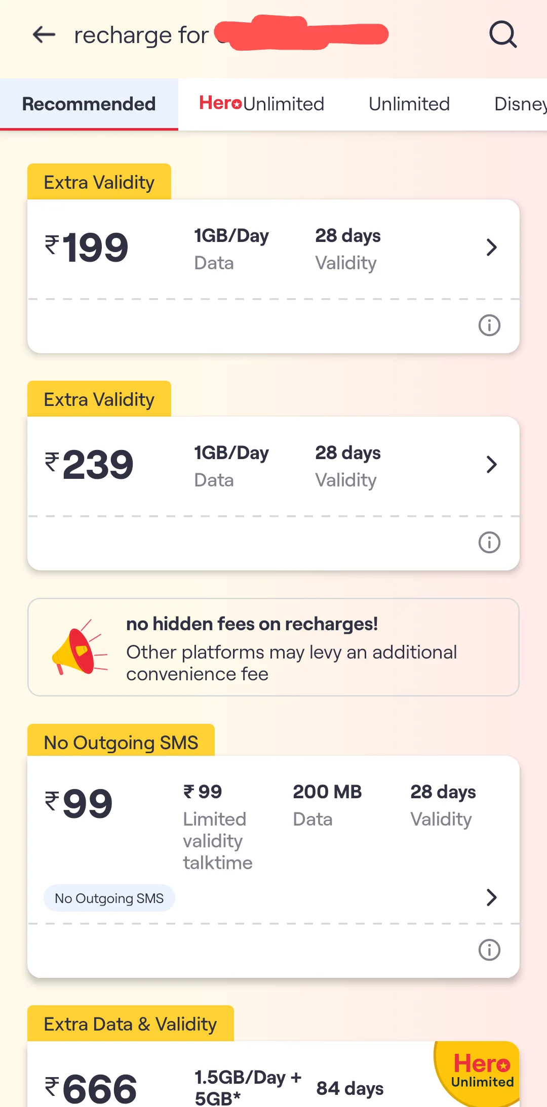
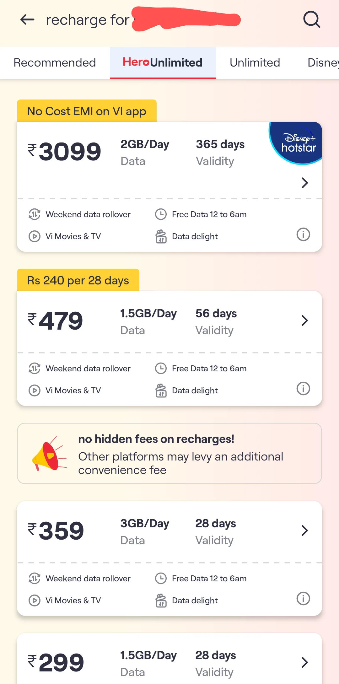
Play Store -
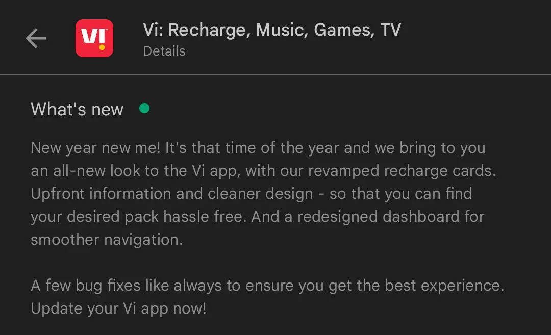
I think they fixed their "AIDS".
And I can assure you that now Airtel & Jio both have terrible looking UI for their recharge section.
Airtel & Jio recharge sections are poorly designed. Specially jio... BSNL's UI is better than their's .
.
If you ask any person who doesn't know about the brands and ask them to tell which one is the best.
Vi implemented card style layout to the recharge page.
Also their home screen has been changed to that dark red Vodafone style colour.
I wanna thank you again.
Why just you... I mean thanks to everyone who criticizes this brand.
It's criticism which makes every brand better than before.
This was really great for me to see by VI.
Hopefully they'll continue the development furthermore and make their app/site even more amazing.
Meanwhile I think we should say the same thing about Jio/Airtel so they can improve the UI too .
.
Anyways everything aside... once again thanks @itachi bro for pointing out their bad stuff.
Really if we don't tell them to do even better they're gonna degrade and go away.
Only way to make any brand survive is to continuously poke them to make improvements.
Have a great day everyone.
Make sure to see the UI by yourself guys
Yesterday you said in this post
1) Who the duck calls themselves Vodafone Idea. Who ever thought this is a great idea. It is just poor marketing. And the vi website is AIDS compared to others.
The entire UI of Vi is horrible.
Whoever is behind it should be fired.
the Vi callertune app and settings are horrible with horrible ui/app
Seems like Vi guys are here in this forum
Today I was randomly checking their International roaming packs as I am going out of India in a few months.
I noticed their website's roaming page had different fonts.
I thought it was always like that so I continued browsing anyways...
Then to check it particularly for my number I opened the Vi app and guys... just look what I saw...
Play Store -
I think they fixed their "AIDS".
And I can assure you that now Airtel & Jio both have terrible looking UI for their recharge section.
Airtel & Jio recharge sections are poorly designed. Specially jio... BSNL's UI is better than their's
.If you ask any person who doesn't know about the brands and ask them to tell which one is the best.
Vi implemented card style layout to the recharge page.
Also their home screen has been changed to that dark red Vodafone style colour.
I wanna thank you again.
Why just you... I mean thanks to everyone who criticizes this brand.
It's criticism which makes every brand better than before.
This was really great for me to see by VI.
Hopefully they'll continue the development furthermore and make their app/site even more amazing.
Meanwhile I think we should say the same thing about Jio/Airtel so they can improve the UI too
.Anyways everything aside... once again thanks @itachi bro for pointing out their bad stuff.
Really if we don't tell them to do even better they're gonna degrade and go away.
Only way to make any brand survive is to continuously poke them to make improvements.
Have a great day everyone.
Make sure to see the UI by yourself guys
Last edited by a moderator:
- Messages
- 1,671
- Location
- Pune
- ISP
- FTTH: TPF (Static v4/IPv6), Airtel (Static v4/IPv6)
5G: Jio, Airtel & VI
Believe it or not, Vi rather the erstwhile Idea cellular Ltd was my favourite mobile network till my company mandated a shift to Vodafone for corporate billing rates. So I had to port out. I also had another SIM from Airtel (terrible experience) but Vodafone was good back in the days and the customer service at their shops was excellent. I cancelled the then Airtel connection and shifted fully to Vodafone.
All that changed around 2014-15, slow but sure deterioration. I went back to Idea from Vodafone and stayed there till the Jio tsunami hit the industry and then ported out in early 2017. I got a Vi connection few months back as a backup for my work and to use in my tab. I find their network to be more stable and usable than Jio. So no matter what happens we the end users NEED at least 3 competitors as long as they dont cartelise their offerings which I sometimes think is happening.
All that changed around 2014-15, slow but sure deterioration. I went back to Idea from Vodafone and stayed there till the Jio tsunami hit the industry and then ported out in early 2017. I got a Vi connection few months back as a backup for my work and to use in my tab. I find their network to be more stable and usable than Jio. So no matter what happens we the end users NEED at least 3 competitors as long as they dont cartelise their offerings which I sometimes think is happening.
D
Deleted member 76459
Jio is good and having good speed of Internet and good call quality
Lolita_Magnum
ᓚᘏᗢ
Jio is good for signal stability and battery unlike other providers I do not see their signals jumping towers every 2 seconds.

 Airtel Xstream Fiber
 - Messages
- 1,671
- Location
- Pune
- ISP
- FTTH: TPF (Static v4/IPv6), Airtel (Static v4/IPv6)
5G: Jio, Airtel & VI
My Airtel prepaid does not, pretty stable here. I think it depends on the locality and extent of coverage there + any obstructions like tall buildings.
Vi isn't offering 5G as of now but TBH it's not my priority. Stability and coverage are and 4G is good enough for now. They're doing well at least for me. If at all I have to fault them then it's their pricing is more than Jio and around the same as Airtel.
Vi isn't offering 5G as of now but TBH it's not my priority. Stability and coverage are and 4G is good enough for now. They're doing well at least for me. If at all I have to fault them then it's their pricing is more than Jio and around the same as Airtel.